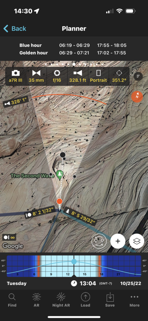
A visit to the Wave should also entail a short walk up the ridge line and over to an area just to the South less than a quarter mile to the Second Wave, which is featured here. The Wave info website suggests that this location is best shot late in the day, preferably during the evening golden hour, which would have been around 5:29 PM MST. This of course would mean me having the hike back in the dark and I had started my day before sunrise. The hike took me a little over an hour using the provided map and my AllTrails route. Hike out timeline was based upon my plan to go to White Pocket or at least Stateline Campground before the end of the day where I wanted to camp overnight.
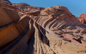
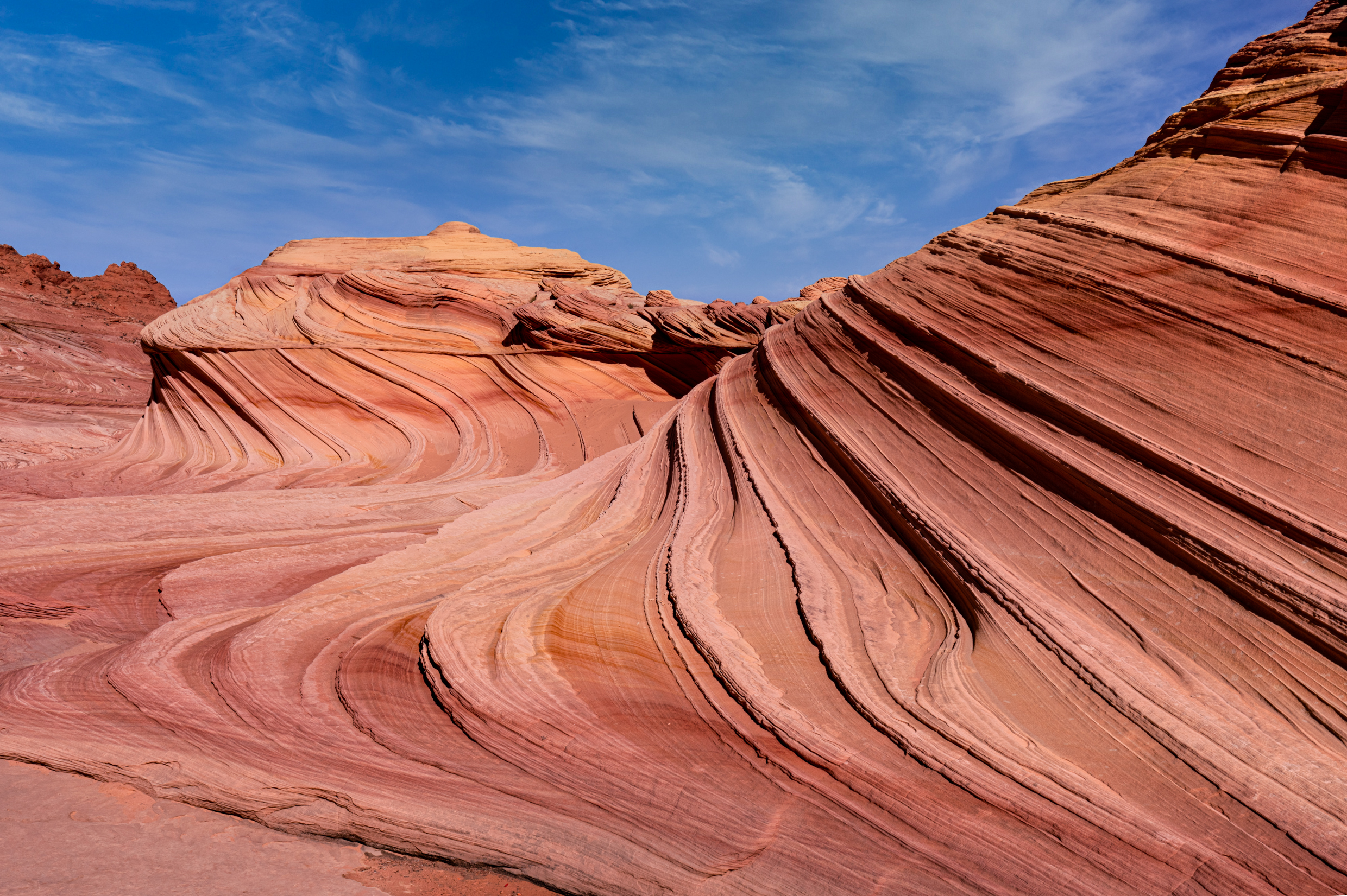
The second wave is cool to see, but like the wave, it is a location that doesn’t offer too many options for an original photo. As shown in this photo, the Northside isn’t as compositionally interesting, as the Southside. Note, that it is best to hike to the Southside using the high side versus walking around the downslope side on the right.
Your primary composition is to use the dominant mountainside lines that wrap along the terrain leading up to the mound. Conceptually the only way to get an original image is to be there when there is a dramatic sky. Initially, when I took this image, it was to recon where I would take the image again later in the day, but after heading back to the wave area to wait, I elected to hike out as I started seeing others leaving and feeling a bit fatigued.
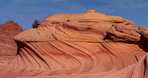 This photo was shot on aperture priority. because it was at the moment a recon photo. The exposure bias showed a -7/10 EV, which I believe was due to the overhead sunlight and needing to underexpose a little to retain the light on top of the mound as suggested by a brightness value of 11.03. During post-processing, I only removed two bushes that were growing on the mounds, as shown here on the left side of the mound.
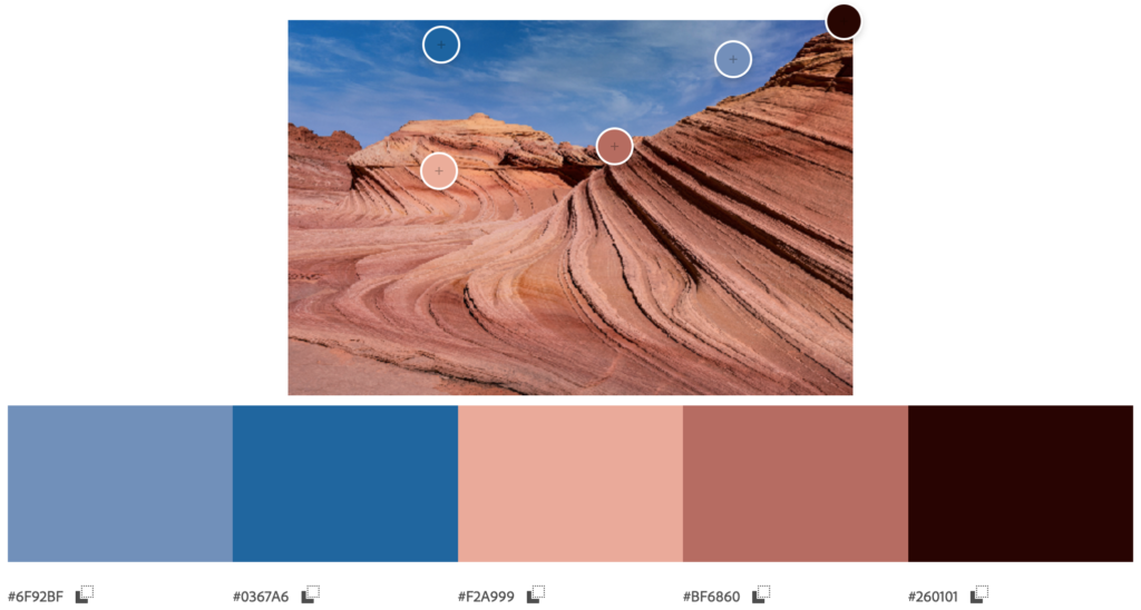
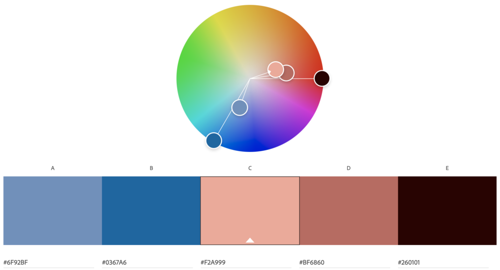
Since the sky covers about a third of the image, I expected at least one shade of blue in the color theme but found two shades. The dominant colors were shades of brown and tan. One of the blue and brown tints was oversaturated and the theme, unfortunately, lacks color harmony. that wasn’t what the extract color theme revealed. What the color wheel shows are that the bluish-gray sky and the tan and gray tints on the sandstone have a complementary harmony.
Finally, PhotoPills was used to frame this composition, and the settings are shown below. Since this was a preplanned composition, this PhotoPills is the actual layout showing that planning with PhotoPills really works.
